Showing posts with label crate paper. Show all posts

Monday, March 19, 2012

Ruby Falls - Crate Paper

When winter begins to lighten and the first warm days of spring appear, we're all itching to get out of the house and do something. This time, Caleb and I decided to take a quick trip to Chattanooga, TN to enjoy the Aquarium. Along the interstate, we were bombarded with signs to visit Ruby Falls. Well, after we finished with the Aquarium we had plenty of day light left so we ventured forth towards Look Out Mountain where Ruby Falls is located. If you've never been to Ruby Falls, you really should visit their site to learn more. Although, I have to warn everyone.... it's very cramped inside. It felt like we were all sheep being herded through. Also, the air was thinner and quite musky down there so steer clear if you have a lot of allergy problems.

Crate Paper - Paper Heart Collection - ValentineCrate Paper - Paper Heart Collection -  FriendshipCrate Paper - Paper Heart Collection - CupidTattered Angels Glimmer Mist - Silver Sugar 

I had a lot of problems at first with colors. All the papers I put next to the picture just overwhelmed it or competed with it. If I picked a pink paper... it looked too violet. If I picked a violet paper...it looked too pink. So, I decided to go with a simple layout using a complementary color. I pulled out Crate Paper's 'Paper Heart' collection and it was just the ticket. The red-violet and yellow-green worked perfectly together. It was such a fun splash of color. (Oh, and a little bit of wood grain never hurts!)


One thing that I always have to watch for is what I call a 'sneaky color'. It's a color that looks like it shouldn't belong but you can't avoid. It might be that strange beach ball in the background that threw in a color you didn't want. For me, it was the lighting in the cave that turned the outside of my photo black. The colors of my papers would've looked best with grey as the dominant color, but I didn't have grey in my picture. So, instead of fighting that sneaky color, I embraced it. I made it my most used color. All the fonts, the stitching, everything was dashed with a bit of black.

Monday, February 6, 2012

The Shop - October Afternoon

I originally planned on doing this layout with the "Kitchen Cupboard" paper from October Afternoon's Farmhouse collection. But since I had just used that entire page on my last layout, I had to find a replacement page. I wanted a deep wood grain so I started to look through my new Two Peas goodies and I found Crate Paper's Valentine page. The color was spot on, and I actually like this page better because it was a simpler page than the OA one. It's so easy to layer on patterns when the background is only slightly textured.


October Afternoon - Farmhouse - Button Box, October Afternoon - Farmhouse - Her Bureau, October Afternoon - Farmhouse - Church Social, October Afternoon - Farmhouse - Clothesline, October Afternoon - Farmhouse - Guest Room, October Afternoon - Farmhouse - Word Stickers, Crate Paper - Paper Heart - Valentine, Tim Holtz - Distress Ink - Vintage Photo, Ranger - Glossy Accents.


This picture is very important because it's the family business. My grandfather was the type of person who never settled for 'good enough'. He created 3 successful businesses, but he always said that he could do more. Then (much to the aggravation of my grandmother) he borrowed money against their farm to build Davis Foreign Auto Parts. It was very successful and he was happy with it for the rest of his days. Once he passed away, it was left to my father. I always look at it with awe. It always takes courage to leave what is safe for the unknown. I've dedicated this page to the legacy he has left behind.


The title was a little tricky for me. I tried a bunch of different papers, but they all had too much pattern on them. It just looked so busy that you couldn't read it. Then, I looked at my cardstock... which didn't help. All the browns I could find were more reddish than I wanted. So, I got an old cream index card and began rubbing it with Tim Holtz's Vintage Photo distress ink. Then, I got on my FMIL's silhouette and cut out the title. I really like the chunky letters and the color is exactly what I wanted. Sometimes things are just easier when you do things yourself. :)


I often look around to get ideas and inspiration. A couple of weeks ago, I saw a layout with a very heavy banner. It was packed full and had different shapes and sizes of pennants. I really loved the fullness it gave, so I stored it in my mind. Unfortunately, I don't remember who the inspiration piece was made by. If you think it might have been you, please send me an email and let me know. I've seen a couple of heavy banners, but they aren't the inspiration piece.


I just love all the images on the "Her Bureau" page. They're just so fun and you can use them each as an embellishment. The little post stamp was tricky. If I were to cut each little perforation separately, then it would take me all day and still come out strange. So I found a trick. I just cut around the sides as close as I could. Then, I punched the little half circles out with a small hole punch. I was done in less than 5 minutes. I then cut out a couple of the buttons and covered them with glassy accents. Of course, I went around all edges with the Vintage Photo pad.

I hope you enjoyed this layout. I'm completely in love with this collection. I'll probably stock up and still be using this stuff next year! lol. If you want to stay up to date on all my projects, you can follow me by clicking the follow button or entering your email into the box located to the right side of this blog. Can't wait to hear from you!

Tuesday, July 5, 2011

Mini Recipe Album

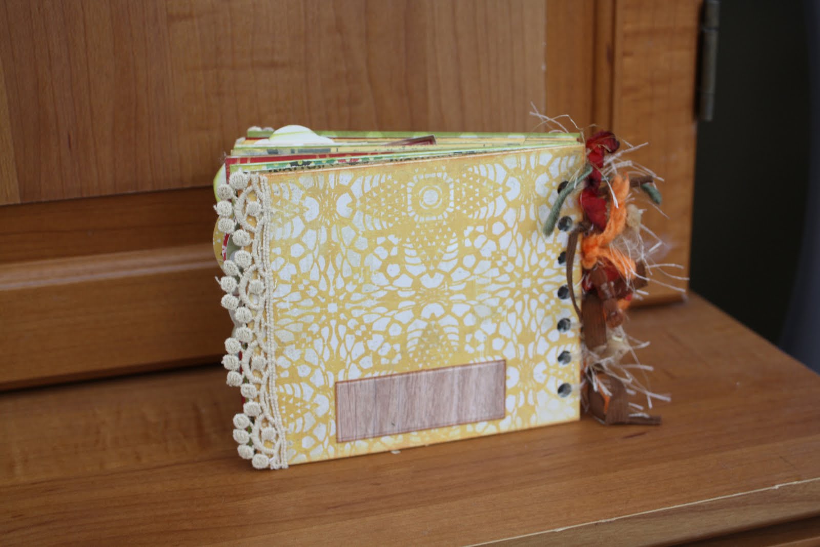
This project was originally going to be the mini album to give to my wonderful FMIL. But once I got started, it just didn't seem like what I wanted to give her. So I stopped working on it and started on my Victorian mini album. Well, now that the Victorian mini album went over so well with her, I decided to come back to the envelope album. I found an adorable page with lots of embellishment possibilities (Kaiser Craft- Nan's favorites collection-Lemon Slice). I cut out pieces and used them as embellishments throughout the album. This gave my album a recipe book feel. So I went with it! It looked so cute and retro.

The embellishment that I put on the front was a little altered. It originally said "Easy as Pie" but I wanted it to say "Made with Love". So, I scanned the paper into Photoshop. I used the patch tool to erase all the words and blend the background. Then I got my own type tool and looked for a font that seemed similar. After I was happy with the look, I printed it out on cardstock and cut it out with an exacto knife.


To the left is a close-up of the binding. I used Graphic 45 fibers, Fun Fur, and dyed seam binding. I may add more later. The binding was made up of clear hair elastics. I really loved the way it turned out because not only is it stretchy, but it's also clear. Clear binding won't disrupt my papers or take away from them.
I found some cute tiny letters from Cosmo Cricket. They worked perfectly for my small scale.


The tabs for each page were made using a 1.5" punch from EK Success.

Each page has two cards inside for ingredients and instructions. I tried to leave the front of each card blank so I can attach a picture of the finished meal.

I added depth to my embellishments by using 3D dots to pop them up.

My wonderful FMIL gave me envelopes to put on my pages. They looked so cute, but I have no idea who makes them. I think she might have made this one.

 I used Studio G ink in a variety of colors to go around the edges of my pages and give them depth. The bottom strip of paper in the picture to the left was actually the cut off portion of a Sassafras paper. It had the title of the paper and the bar code on the back. Normally, you would throw it away, but it just looked so cute that I kept it.

The paper on the left side accidently got pasted on upside down. So I put a paper doilie on it to give it texture and to hide my mistake.

I wanted to have a spot on the back where I could write down the date or a sentiment if I wanted to give it as a gift.


I hope everyone enjoyed this little album as much as I did. I can't wait to add my photos and recipes to this little guy. I showed it to my FMIL and she decided to make one too! (Although her's is already looking better! LOL).

Materials Used:
Ink- Studio G
3D Dots- EK Success
Paper- October Afternoon- Seaside- Sailboat
            Lilybee Design- Catching Fall- Cashmere Sweater
           Crate Paper- Restoration Collection- Lace
           Echo Park- For the Record- Fabric Store
           Sassafras-Applejack- AJSLDSP - 11402
Type-  Cosmo Cricket- Tiny Type
Adhesive- Terrifically Tacky Tape